Address
Rotterdam
Work Hours
Monday to Friday: 9AM - 7PM
Weekend: Preferably not

Create a strong, unique and overarching brand concept that would help merge numerous citizen responder organisations. Starting off in the Netherlands, but eventually an identity that can hold its own on international, global level.
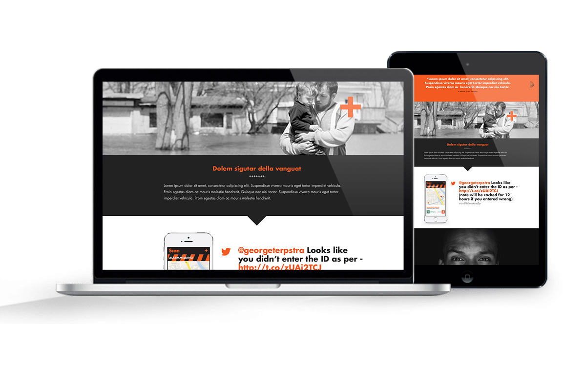
As one of Hollands’ largest citizen responder organisations, HVW (Hartveilig Wonen) asked Real Concepts agency to come up with a concept that would help set their application apart from other competitors. The application facilitated real time quick and highly important aid from citizen responders to increase the chance of survival in case of a cardiac arrest.
Made possible using smart technologies and with a direct link with the dispatch centers and fully integrated in the CAD or triage system.
Real Concepts asked me to join the concept development proces to come up with an idea how to brand the organisation and think of an initial communication concept to draft more volunteers.
All these volunteers have one thing in common. They put helping other people first, wether in private time or work mode. All with their own specific competences. Hero’s in my book, because they choose to be always on standby. That gave me the direction to come up with the ‘title’ or archetype name for these heroes: Stan(s).
A name that is easily pronounced on global level and a name that relates to the core essence of these volunteers: always on STANdby. Also, it made way for unique url’s and social ID handles. In Dutch, ‘Ik ben Standby’, or ‘I am Standby’ explains the organisations core competence and facilitates a sense of ‘ownership’ for the volunteer.

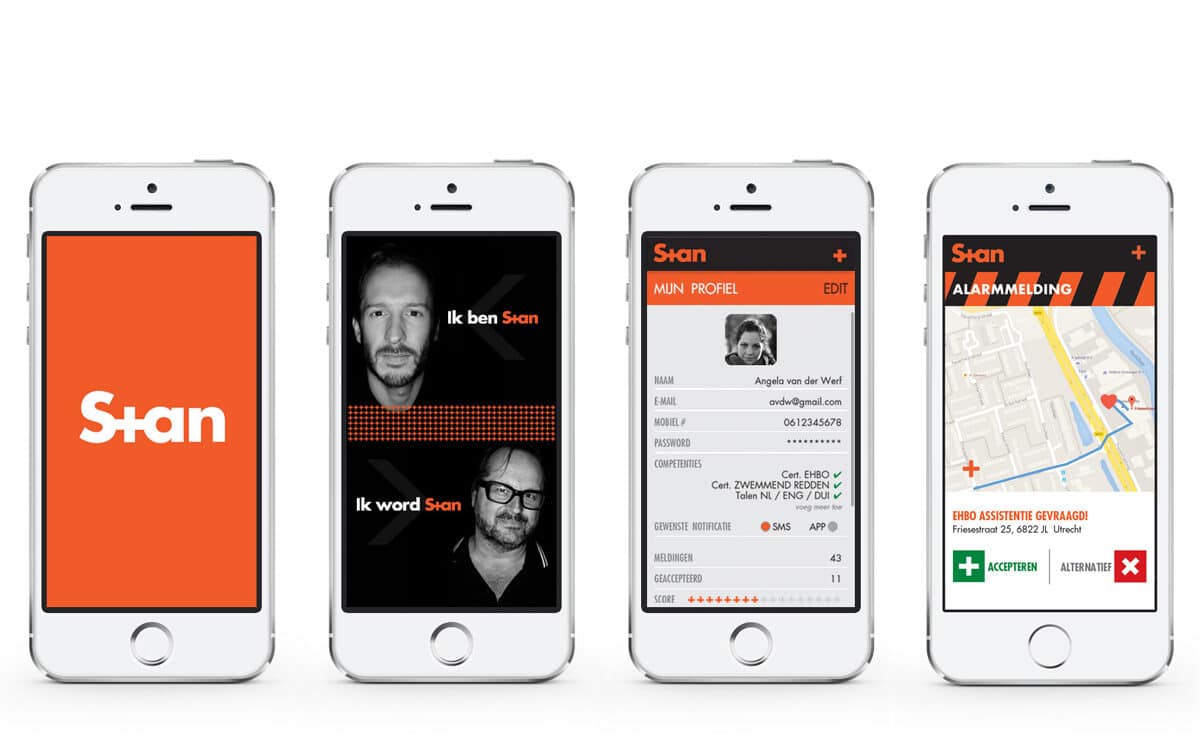
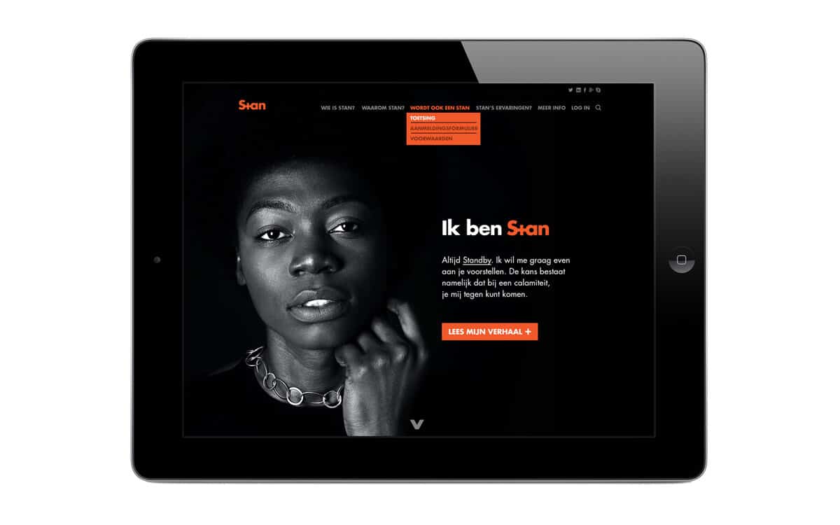
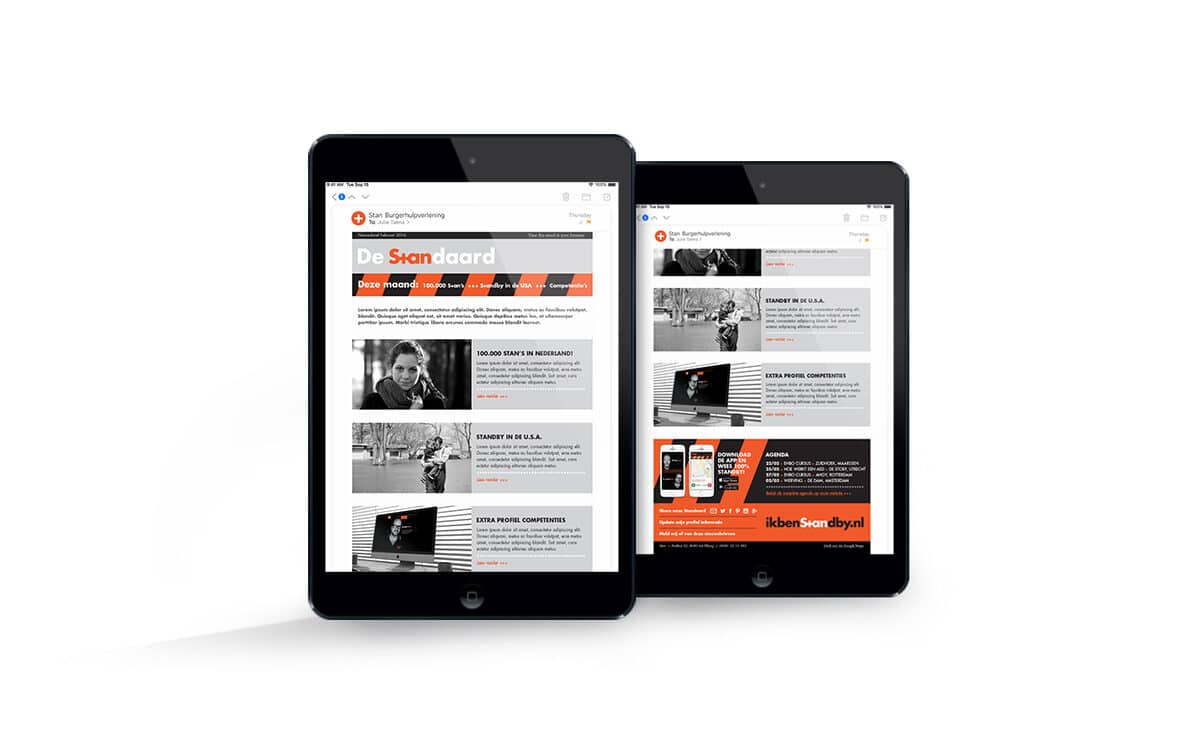
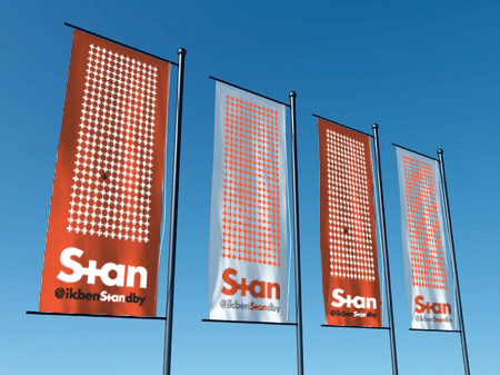
Setting these volunteers apart from the other emergency response units made me come up with the simple yet strong black, white & orange color palette. Easily identifiable. And with a small yet subtile hint to the companies origins. Using greyscale imagery, the seriousness of the overall subject (provide a valuable addition to professional emergency services when the first six minutes are crucial) stayed guaranteed.